
Today's Spring Training workout from
Ella Publishing Co. is to stretch your imagination and find inspiration from an ad. We did just that at our last crop with this awesome Starbucks ad that
Celeste Smith found and shared with us. Celeste Wrote,
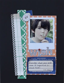
"Use what you like - the Polaroid photos, the sketchy font title, the black background...you could even just do a page about your love of Starbucks!"

You can see that Celeste used a dark background and a Polaroid type print on her page. If you need a Polaroid maker, check out the website
http://www.poladroid.net/. And now we thought we'd share a few of the inspiring layouts our awesome customers created . . .

From Cendrine Grinand

From
Christina Aiton,
"I love Starbucks and oh yeah, my DH too!"
From Keri, "I was inspired by the wavy line, the layered photos, the sketchy font, the circle accents, and the little "x"s."

 Today's Spring Training workout from Ella Publishing Co. is to stretch your imagination and find inspiration from an ad. We did just that at our last crop with this awesome Starbucks ad that Celeste Smith found and shared with us. Celeste Wrote, "Use what you like - the Polaroid photos, the sketchy font title, the black background...you could even just do a page about your love of Starbucks!"
 You can see that Celeste used a dark background and a Polaroid type print on her page. If you need a Polaroid maker, check out the website http://www.poladroid.net/. And now we thought we'd share a few of the inspiring layouts our awesome customers created . . .


No comments:
Post a Comment