We are so very excited to be sponsoring
Ella Publishing's Spring Training over the next two weeks! Today's workout from Wendy Smedley is amazing! So amazing, that a few of our design team members were motivated to get in the game! You can join in too! Head on over for
Day 1 and learn to stretch your style! Did I mention prizes?

Today's challenge is to "Share a layout that shows off your signature style!"
Shimelle Laine shares one hot off the press! She says, "My style elements that are shown there are: a love of colour (with a u. colour is better with a u.)... 4x6 photos - my favourite size, and i often use just one or two on a page... the kind of layering that happens by just looking for gaps on the page and then things to fill the gaps. i could work for hours on filling little spots of pages and then leave the rest quite open with a patterned paper... a mix of handwritten journaling and a wordy title. i love long titles and lots of letter stickers.
 Danielle Flanders
 asks, "How about a card? (We say YES!) I think my style is on the feminine side and a little bit shabby. I love to add layers of interesting details and use products in a unique way!"
 Jill Sprott
 writes, "Although I think of style as something organic, shifting and changing as we shift and change, I do notice that there are some telltale elements that have been present in my style for years:-- Bright colors mixed with neutrals. I definitely prefer colors that pop, but I also tend to go for neutral backgrounds so that I can have a bit more freedom when adding bolder colors to a page. -- Bits and pieces. Scissors in hand, I hunt for "telling" bits and pieces to add to my layouts. I especially love cutting patterns and journaling cards into smaller pieces and finding homes for them on a layout, working them into the layers. "Gatherings" of bits and pieces also tend to show up often on my pages. -- Sewing. A page never feels finished to me unless it includes some form of stitching.-- Painterly touches. Paint and mist always add that extra oomph and equal parts loveliness and funk to patterns and accents. -- Motifs. There is always some kind of repeated pattern or idea on my layouts. It's the English major in me, no doubt; I'm always working with a metaphor, a symbol, or a central theme."

From
Lisa Dickinson, "My scrapping style is simple, using a minimum of products, but I don't want it to look plain or boring. So I like to throw in something unexpected or just a bit messy to keep things visually interesting. Sometimes it's as simple as tilting the photos in a very linear design, or adhering the title letters a bit askew. Sometimes it's a spray of mist on the background. And sometimes, as with this layout, it's all these things! This layout is very "me" because on the surface it's simple (a grid of squares) but take a second look and you'll see there's plenty of interesting elements in the details."
 Stephanie Howell
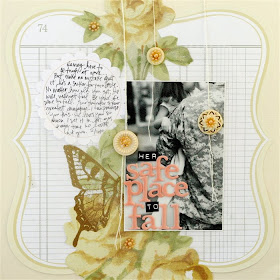
 shares, "This layout is my style for several reasons. It has a black and white photo, handwritten journaling, soft and feminine accents (pearls,tulle,flowers)...but most of all it's an emotional, from the heart kind of a page. or as my friend Jill told me..."soul scrapping". That's kind of my niche and it makes me happiest when i make pages like this one!"
 We are so very excited to be sponsoring Ella Publishing's Spring Training over the next two weeks! Today's workout from Wendy Smedley is amazing! So amazing, that a few of our design team members were motivated to get in the game! You can join in too! Head on over for Day 1 and learn to stretch your style! Did I mention prizes?
 Today's challenge is to "Share a layout that shows off your signature style!" Shimelle Laine shares one hot off the press! She says, "My style elements that are shown there are: a love of colour (with a u. colour is better with a u.)... 4x6 photos - my favourite size, and i often use just one or two on a page... the kind of layering that happens by just looking for gaps on the page and then things to fill the gaps. i could work for hours on filling little spots of pages and then leave the rest quite open with a patterned paper... a mix of handwritten journaling and a wordy title. i love long titles and lots of letter stickers.
 Danielle Flanders asks, "How about a card? (We say YES!) I think my style is on the feminine side and a little bit shabby. I love to add layers of interesting details and use products in a unique way!"
 Jill Sprott writes, "Although I think of style as something organic, shifting and changing as we shift and change, I do notice that there are some telltale elements that have been present in my style for years:-- Bright colors mixed with neutrals. I definitely prefer colors that pop, but I also tend to go for neutral backgrounds so that I can have a bit more freedom when adding bolder colors to a page. -- Bits and pieces. Scissors in hand, I hunt for "telling" bits and pieces to add to my layouts. I especially love cutting patterns and journaling cards into smaller pieces and finding homes for them on a layout, working them into the layers. "Gatherings" of bits and pieces also tend to show up often on my pages. -- Sewing. A page never feels finished to me unless it includes some form of stitching.-- Painterly touches. Paint and mist always add that extra oomph and equal parts loveliness and funk to patterns and accents. -- Motifs. There is always some kind of repeated pattern or idea on my layouts. It's the English major in me, no doubt; I'm always working with a metaphor, a symbol, or a central theme."
  From Lisa Dickinson, "My scrapping style is simple, using a minimum of products, but I don't want it to look plain or boring. So I like to throw in something unexpected or just a bit messy to keep things visually interesting. Sometimes it's as simple as tilting the photos in a very linear design, or adhering the title letters a bit askew. Sometimes it's a spray of mist on the background. And sometimes, as with this layout, it's all these things! This layout is very "me" because on the surface it's simple (a grid of squares) but take a second look and you'll see there's plenty of interesting elements in the details."
 Stephanie Howell shares, "This layout is my style for several reasons. It has a black and white photo, handwritten journaling, soft and feminine accents (pearls,tulle,flowers)...but most of all it's an emotional, from the heart kind of a page. or as my friend Jill told me..."soul scrapping". That's kind of my niche and it makes me happiest when i make pages like this one!"
Everyone did a fabulous job on their projects (love Shimelle and Stephanie blogs)TFS
ReplyDelete