Pages

Friday, April 29, 2011

Betsy Sammarco's Vintage Mortar and Pestle


Today's vintage find is from Betsy Sammarco who writes, "This is a very special item in my house. It may not look like much. As a matter of fact, it even has "vintage goop" stuck on one side of it.

This old wooden mortar and pestle was a birthday gift to me years ago from my mom. It was given to me the birthday after I graduated from pharmacy school and passed my licensing exam. What a very special and appropriate gift to give to this vintage-loving-pharmacist! This gift says a lot about me and is so much of who I am.
I've mostly had it on display in various places around the house, but lately have been using it as storage for my chandelier crystals.

This vintage find holds my crystals today and holds a very special place in my heart always!"


Thanks for sharing a treasured "vintage" memory with us Betsy!

Ad Inspiration . . .


Today's Spring Training workout from Ella Publishing Co. is to stretch your imagination and find inspiration from an ad. We did just that at our last crop with this awesome Starbucks ad that Celeste Smith found and shared with us. Celeste Wrote, "Use what you like - the Polaroid photos, the sketchy font title, the black background...you could even just do a page about your love of Starbucks!"

You can see that Celeste used a dark background and a Polaroid type print on her page. If you need a Polaroid maker, check out the website http://www.poladroid.net/. And now we thought we'd share a few of the inspiring layouts our awesome customers created . . .


From Cendrine Grinand


From Christina Aiton, "I love Starbucks and oh yeah, my DH too!"


From Keri, "I was inspired by the wavy line, the layered photos, the sketchy font, the circle accents, and the little "x"s."

Thursday, April 28, 2011

Shimelle Laine in THE Dress


It's a very inspiring day today with Shimelle Laine and the Be Our Guest collection . . .

My first chance to play with all the new goodies from the Be Our Guest collection!

I started with the pink check as the background. Love that the new cardstock-weight paper makes it great for a page background without any extra cardstock. Perfect!

Then stamped the ledger design with fountain pen ink in the bottom corner, and used two journaling cards in this cluster of embellishments - the pink silhouette from Be Our Guest and also the red carnation from an earlier pack. I write my journaling on the blue ledger paper from Be Our Guest and cut it to fit a glassine envelope, then added some black floral ribbon (American Crafts) to the journaling for more dimension. There's also a button card in there as an embellishment. Just inked the edges and left the buttons as they came. Of course there's also an embellished butterfly there and there's a JBS pearl sticker on the flower with a smaller butterfly sticker at the top left corner. The 'photographs' stamp is one I found at an antique fair for £1, and I stamped it with fountain pen ink on a scrap of old book paper.

The journaling is all about the dress and its quirks. I wanted something not long but not actually 'short'. I wanted white with some colour (preferably pink). I wanted sleeves even though it was summer. And a peter pan collar. And in the end I found all of that in one dress by a London designer, Candy Anthony. Once I found the dress, everything else fell into place!

Other supplies - Thickers letters for the title (American Crafts), Martha Stewart border punch, House of 3 diecut in the top left corner and some elastic cable by Making Memories. The photo is by SJ Dowsett. (Scrapbooking brides: put your dress back on just a bit after the wedding/honeymoon and get a scrapbooker to take pictures of you. You will be so very glad you did.)


SO Beautiful! Thanks for the inspiration Shimelle!

Distressing . . .

We hope you'll pop over to Ella today for another Spring Training workout! Today's topic is "distressing" and since Michelle McCord is our resident distressing master, we asked her to share a few of her distressing secrets with you. :)


One of my favorite things to do on a layout is distressing. I have lots of different 'tool's that I use to get the distressed look. One of my favorite things to do is tear paper along a straight edge of a ruler. It gives it a little bit of an uneven edge, and then I can curl the edges up with my fingernails if I want. You can see on my Best of Friends layout, I did just that.


Another one of my favorite 'tools' just happens to be my fingernails! I love to turn up the edges of embellishments, paper, whatever can be 'bent', really. On my 'Goofy' layout, I used my fingernails to turn up the edges of the penant banner so that it looks as if they are blowing in the wind. I also used my fingernails on the hearts on the page, and put a crease in the middle of them before adhering them to the page. It also gives the hearts a 3-d look.


Yet another favorite tool of mine is not a scrapbooking tool at all....a serrated steak knife! with practice using the knife, you can get some GREAT looking distressed edges and rips in your paper that look like they really are supposed to be there. On my Goofy Girl layout, I used the steak knife around the edges to soften them up a bit.

Wednesday, April 27, 2011

Dime Store YUM! from Celeste Smith

Just can't get enough of the "Tangerine Dream" in the 2nd Quarter Dime Store Kit? We can't either! Here's one more from Celeste Smith who writes, "With all of those inspiring Dime Store kits last week, I couldn't resist the pull of the orange and turquoise. The colors look fabulous with black and white photos. Love these colors on layouts of my boy. A little tilting and a little stitching and a fun layout is born!"

Capturing Personality . . .

Today's Spring Training Prompt is to "Upload a page featuring your best people photos—those that really capture the subject’s personality." We've asked Becky Novacek to share a few words on this, because she's just SO awesome at capturing personality! Check out her blog and you will fall in love with all the smiling faces you see. Becky says, "Getting a person to relax and catching them in that moment is the best! I like to just chat it up and encourage them to be who they are...if it's someone I don't know well, I just ask them about their interests and that usually lights people up! Harper is very easy to capture, just because she is oblivious to the camera!"


Thanks for the inspiration Becky! And be sure to swing by Ella this morning for another crafty workout! :)


Tuesday, April 26, 2011

One Sentence Journaling . . .

"every now and then the camera still catches a glimpse of the baby you used to be and my heart gives a little flutter."


Doris here, and I just have to say how much I love today's challenge from Ella Publishing's Spring Training: Create a layout featuring single-sentence journaling. I can do this! In fact, I think many of my favorite layouts are ones with a picture that has captured my emotions and that one thought that takes hold of my heart. These layouts can be whimsical, poignant, or thought provoking. One sentence journaling . . . do try this challenge. One sentence can speak volumes.


"he who has the hose holds the power."

"you cannot resist puddles and i cannot resist you."

"life is in the details."

Monday, April 25, 2011

Spring Training with Ella Publishing!

We are so very excited to be sponsoring Ella Publishing's Spring Training over the next two weeks! Today's workout from Wendy Smedley is amazing! So amazing, that a few of our design team members were motivated to get in the game! You can join in too! Head on over for Day 1 and learn to stretch your style! Did I mention prizes?

Today's challenge is to "Share a layout that shows off your signature style!" Shimelle Laine shares one hot off the press! She says, "My style elements that are shown there are: a love of colour (with a u. colour is better with a u.)... 4x6 photos - my favourite size, and i often use just one or two on a page... the kind of layering that happens by just looking for gaps on the page and then things to fill the gaps. i could work for hours on filling little spots of pages and then leave the rest quite open with a patterned paper... a mix of handwritten journaling and a wordy title. i love long titles and lots of letter stickers.

Danielle Flanders asks, "How about a card? (We say YES!) I think my style is on the feminine side and a little bit shabby. I love to add layers of interesting details and use products in a unique way!"

Jill Sprott writes, "Although I think of style as something organic, shifting and changing as we shift and change, I do notice that there are some telltale elements that have been present in my style for years:-- Bright colors mixed with neutrals. I definitely prefer colors that pop, but I also tend to go for neutral backgrounds so that I can have a bit more freedom when adding bolder colors to a page. -- Bits and pieces. Scissors in hand, I hunt for "telling" bits and pieces to add to my layouts. I especially love cutting patterns and journaling cards into smaller pieces and finding homes for them on a layout, working them into the layers. "Gatherings" of bits and pieces also tend to show up often on my pages. -- Sewing. A page never feels finished to me unless it includes some form of stitching.-- Painterly touches. Paint and mist always add that extra oomph and equal parts loveliness and funk to patterns and accents. -- Motifs. There is always some kind of repeated pattern or idea on my layouts. It's the English major in me, no doubt; I'm always working with a metaphor, a symbol, or a central theme."

From Lisa Dickinson, "My scrapping style is simple, using a minimum of products, but I don't want it to look plain or boring. So I like to throw in something unexpected or just a bit messy to keep things visually interesting. Sometimes it's as simple as tilting the photos in a very linear design, or adhering the title letters a bit askew. Sometimes it's a spray of mist on the background. And sometimes, as with this layout, it's all these things! This layout is very "me" because on the surface it's simple (a grid of squares) but take a second look and you'll see there's plenty of interesting elements in the details."

Stephanie Howell shares, "This layout is my style for several reasons. It has a black and white photo, handwritten journaling, soft and feminine accents (pearls,tulle,flowers)...but most of all it's an emotional, from the heart kind of a page. or as my friend Jill told me..."soul scrapping". That's kind of my niche and it makes me happiest when i make pages like this one!"

Repurposed Washboard by Betsy Sammarco

Try repurposing a vintage washboard into a memo or inspiration board!

First, you'll want to find your washboard. The washboard needs to have a metal washing surface. Some washing surfaces were glass and some reproductions are plastic. You’ll need the metal surface for the magnets to work.


I found a washboard with a nice header on it. Since my board will be used in the sunniest room of our house, it was perfect!


Here's what I did to customize my washboard:


1. Make a removable butterfly topper:

Cover a JBS Butterfly Chipboard piece with JBS patterned paper. I added a piece of Sunburst chipboard to add to the "sunny" theme. The butterfly's body is made of various buttons.


The butterfly's antenna is a Rhinestone Bow Embellishment turned upside down:


Magnets are glued onto the back of the butterfly with Helmar's Professional Acid Free Glue.


By adding magnets to the butterfly topper, it can now be removed or changed around as needed.


2. Make the decorative magnets:


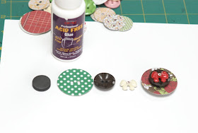
The magnets are Chipboard buttons, Vintage Sew-On buttons, and other embellishments layered on top of each other and glued with the Helmar glue.


The Helmar glue holds the magnets quite well and you can take the button magnets on and off without worry.


3. Use your new memo/inspiration board! Mine is hanging in my scrapbook area holding bits and pieces of inspiration!


JBS Mercantiel May Peek!


Here is one little peek at May's kit from Doris Sander. Do you follow us on Twitter or Facebook? We'll be updating you on those sites this week as our designers share more peeks. The May Kit and Gallery go live this Saturday at midnight! Looking forward to it!

Sunday, April 24, 2011

Easter Decor with Bridgette Truong

Hi Everyone! Bridgette Truong here and I'm back with another Shadowbox layout! (you can see my October one HERE and December one HERE.


I decided to do things a bit different this time and use all the mini bingo cards from a pack, instead of just one in the center. There aren't any pictures of it hanging in the shadowbox with cute easter accents on the shelf below because we just moved a few months ago and I have yet to hang a few things up.
I have to admit that this shadow box was a bit difficult to do, as I am not the best at mixing. I took the 'baby girl' print from a mini paper pack and inked it with the chewing gum ink so you wouldn't focus on the fact that it said 'baby girl'. LOL I used a butterfly die and punch to make some butterflies. I topped the larger butterfly with a yellow butterfly sticker and folded the wings up to make it dimensional. Now, I know a frog seems a bit odd for an easter shadow box, but my oldest son adores frogs, and there isn't a store I have gone in to that hasn't had a stuffed frog with bunny ears in their easter stuff. So frogs are spring-y. For the frog, I used a light green cardstock inked with stick candy to make it stand out a bit more from the grass underneath.

I used a punch and cream cardstock from this pack for the basket and eggs, and inked the eggs with chewing gum, soap powder, and lemon drop. I added a few mini butterflies, and also used my butterfly punch to punch out one from a yellow banner sticker. I used a variety of banner stickers on baker's twine for the "Happy Easter" and the rhinestone bows to finish them off. I have to say, I think this is my favorite one yet. Thanks for having me!

Happy Easter everyone! and thanks for the inspiration Bridgette!

Friday, April 22, 2011

Vintage Easter Decor from Becky Novacek


Here is a little vintage Easter inspiration from Becky Novacek. We hope you are all having a lovely holiday weekend with friends and family.

Jill Sprott and the Dime Store Kit

Hi all!  It's Jill here, happy to be sharing yet another Dime Store kit creation with you.

I just can't get over the amazing colors in this kit.  The turquoise and vermilion really POP alongside each other, don't they?  This complementary color scheme is a favorite of mine, and this layout is the proof!

In the spirit of all that "pops" deliciously, this layout features a favorite restaurant of ours, Cholo's, which is on the North Shore of Oahu.  The colors in the kit remind me of the flavors we experience there when we indulge in salsa, cheese enchiladas, fried rice, and refried beans.  Yummy!

The page makes use of simple layers -- cards over cards, stickers over stickers, and a banner over a banner.  Since everything in the kit already works perfectly together, the page itself really came together in no time at all!

I added an extra punch to the red chipboard buttons by misting over them.  I just love how the brocade pattern still peeks through.   

I will definitely be going back for a second helping of this kit!