I think when it's your birthday, you should be celebrated all month long. With that thought in mind, i created this banner in festive fall colors for my son's October birthday and hung it from our mantel to be enjoyed. It was super easy to create. I simply covered the Chipboard Flag Banner pieces with patterned paper from the October Papercrafting Kit and then added the XL alphabet stickers from the October Artisan Add-on. I couldn't be happier with the results. I was slightly bummed when I realized that I didn't have the letters left to spell Merry Christmas for a December banner. That depression quickly passed when I figured out that I could just spell Feliz Navidad instead. Perfect!
Thursday, October 30, 2014
Wednesday, October 29, 2014
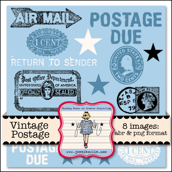
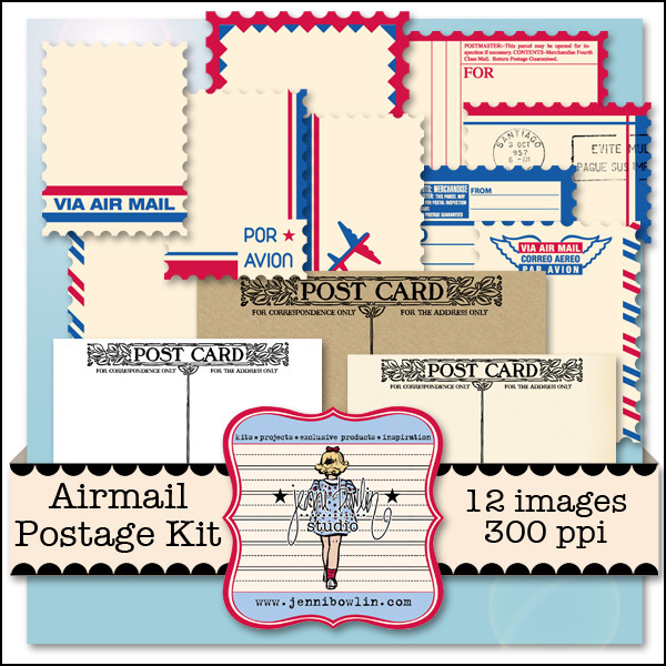
Need Digital Postage?
We've got it on sale for you today! It's Sale Day over at Snap Click Supply and we have two very useful kits on sale:
only 50% ($1.49 today)
only 50% ($1.49 today)
Travel projects, vacation layouts, "Miss You" cards, postcard art, even Valentine's projects can use the digital elements in these kits.
Here are two examples of how our Creative Team used these kits in their projects:
So beautiful and so artsy! Thank you ladies!
These kits are on sale throughout today Wednesday, until midnight PT. So grab yours now.

Sunday, October 26, 2014
Two New Digi Releases this Weekend! Layout by Carrie!
We think you'll love our digital releases this weekend. We have TWO new kits for you!
The uber talented Carrie Arick made this layout using lots of JBS digital supplies. Did you see how she changed the color of the flatback to match her background paper? Here's how she did it:
To change the flatbacks to match the page, I selected the color in the color palette. Then I selected the flatback icon layer in the layers palette. I created a solid color adjustment layer, which I clipped to the flatback icon. (crtl +alt+ g in Photoshop CC) The I changed the blending mode to of the adjustment layer to "color".
I need to try this out myself! Thanks for the color changing tip Carrie!

Thursday, October 23, 2014
From Pinterest to Scrapbook Page | Circle Inspired
My Pinterest boards are overflowing with inspiration for fashion, cooking, home decor, and of course, scrapbooking! But it's not just layouts and sketches that provide starting points for my page designs. Recently I cam across this pin, featuring a giclee print available on Etsy:
I was drawn to the series of circles, each with their own unique texture. And since I am a huge fan of grid designs, the 3x4 arrangement of elements was a composition I knew I could replicate on a page.
Using the October Papercrafting Kit, I cut circles slightly smaller than 3 inches in diameter from the kit papers, as well as two photos of my kids in the pumpkin patch. To mimic the texture in the inspiration piece, I added simple twine stitching to some of the circles.
So what is inspiring you on Pinterest on lately? How could you translate it to a scrapbook page? We'd love to see what you create! And don't forget to check out the JBS Pinterest Boards for lots of inspiring layouts, cards, projects, and more!

Labels:
fall,
layouts,
lisa,
Lisa Dickinson,
october,
papercrafting
Wednesday, October 22, 2014
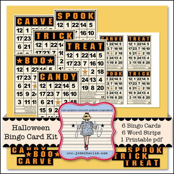
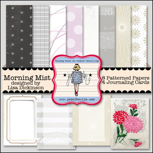
Digital Morning Mist and Halloween Bingo on sale 10/22 | Beautiful Inspiration
We have gorgeous kits on sale today Wednesday 10/22 and there's still time to grab 'em! These kits are on sale through midnight pacific time!
So useful for this season and only $1.00 today:
and for only 1/2 price at $1.75 today:
Take a look at what our very talented creative team has done with our Morning Mist kit:
JBS-Morning Mist, JBS-Definition Labels, JBS-Printer's Block Alpha, JBS-Watch Faces, JBS-Pearl Baubles and JBS-Vintage Bling.
JBS-Definition Labels, JBS-Morning Mist, JBS-School Days Alpha, JBS-Soda Water Icons by Jenni Bowlin Digital; Flair Builder by Mommyish, Stitching & Staples by Carrie Arick; Font: Traveling Typewriter
Thank you ladies for your beautiful digital layouts!

Labels:
carrie arick,
Cassie Wiscarson,
digital,
susie moore
Tuesday, October 21, 2014
From Pinterest to Scrapbook Page: Bold Letters
I will admit that I was a bit intimidated by the large letter stickers from the October Artisan kit. I could have skipped using them. However, I am not one to shy away from a challenge. Instead, I chose to peruse Pinterest for a few ideas.
It's easy to get lost on Pinterest. I like to approach the pins with a purpose and to set a time limit for me to search within. My goal was to search my boards for layouts or magazine ads that featured large bold letters. Almost immediately, I found a magazine cover that would work. Don't waste too much time second guessing yourself. Choose the inspiration that stands out to you in that moment.
It's easy to get lost on Pinterest. I like to approach the pins with a purpose and to set a time limit for me to search within. My goal was to search my boards for layouts or magazine ads that featured large bold letters. Almost immediately, I found a magazine cover that would work. Don't waste too much time second guessing yourself. Choose the inspiration that stands out to you in that moment.
 |
| Pin from Cover Junkie |
This particular cover reads almost like a scrapbook sketch. It is clear where the title and photos should be placed. Journaling can easily fit in the space allotted to list magazine articles. Looking at this cover, I knew I wanted a four letter title and at least three photos.
One Halloween, my son went around Sea World posing as though he were one of the theme park characters. He had the parade day hand wave down pat and even offered to pose with strangers for photos and autographs. I had a big kick watching him ham things up that day. It was easy for me to conceive the four letter title to match these photos.
I began the layout by placing the title on cardstock. I then added the photos, leaving space in the center for journaling. My photos weren't quite large enough to fit the space in the same manner as the photos in the magazine cover. I chose to add a piece of patterned paper as filler. I could then cut down the cardstock and mount it to a piece of patterned paper.While I like the bold graphic look of the magazine cover, it's just not quite my style. I chose to layer in vintage tickets, patterned paper and stickers.
Pinterest can yield many inspiring results. Approach Pinterest with a specific goal in mind,then set a timer and look around. It never takes long to find the perfect inspiration.

Monday, October 20, 2014
Scared-y Cats Are Not Just For Halloween!
It's no secret that my son and I love our kitties. As I was unpacking my October kits i was particularly delighted with the scared-y cat stencil (and digital cut file!), matching stamp, and black cat sequins in the Papercrafting Kit. I knew I would be using them often, not just for Halloween.
My first thought was to do a layout about Pepito, our boy kitty. He is afraid of everything! Perfect, right? As I was looking through my recent photos for a suitable photo to use to tell this tale, I came across this one and laughed. My son can be a bit of a scared-y cat at times, too. It was a fun play on words as Chichi, our girl kitty, and I are the brave ones at our house.
I used the stencil, grey ink, and a blending tool to create my own scared-y cat patterned paper. I then stamped the cat in black on a bit of vintage paper to use as an accent piece. I love how this layout turned out and think the cat motif helps tell our story so well.
Of course, those cats are perfect for Halloween too, as Jill Sprott shows us! :)

Friday, October 17, 2014
Planning a Halloween Party? Check out Chantalle's Invite!
Chantalle McDaniel has sent us a beautiful Halloween Invitation and tutorial! It is so very clever, as she creates a pocket to hold her invite and the invite flips over for all the party specifics.
Lets hear from Chantalle as she tells us just how she's made it:
'Too cute to spook’ invite
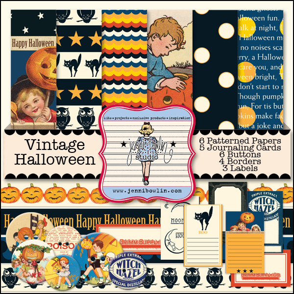
Halloween is one of my very favourite times of the year. We host an annual costume party at our place and have loads of fun! If you are thinking about making up some invites for your party, the JBS Vintage Halloween collection is perfect!
The pocket was created by printing off some ‘Starry Night’ paper onto plain card stock. It took a bit of time to work out the double sided printing, hehe! I have tiled the star print at the bottom a bit, so I could have the pattern show when I folded it over.
The children and pumpkin have been fussy for interest. Machine stitch your pocket closed.
The title was half printed directly onto the design and half printed off onto card stock and cut out. This adds great dimension. Machine stitch on for even more definition.
The reverse is a journalling card, increased to a large size. For a seamless look, sample the cream colour of the card and give your background the same colour so you don’t get a white edge.
The design of this card has been set in a word procession programme (I use InDesign)
For a final flourish, the cute kitty has been given a slick of Glossy Accents to make her pop on the paper.
Thank you Chantalle! Here are the supplies Chantalle used:
Not a hybrid scrapper? Try using our October Papercrafting Kit to create the same "pocket type design" invitation. The Papercrafting Kit comes with the Scary Cat clear stamp too!

Thursday, October 16, 2014
October Gallery and Flea Market Updates!
Happy Fall, Ya'll! It is certainly finally feeling like the seasons are changing here in Tennessee, and Christy Strickler has actually even found a fall display in the Bahamas! Be sure to check out our design team gallery for more inspiration with our October Kits.
You can also find lots of great new pieces in the JBS Flea Market, including some globe displays handmade by Jenni Bowlin. There's also still time to enjoy the selection of Halloween themed product you'll find there. Happy Fall shopping!
You can also find lots of great new pieces in the JBS Flea Market, including some globe displays handmade by Jenni Bowlin. There's also still time to enjoy the selection of Halloween themed product you'll find there. Happy Fall shopping!

Wednesday, October 15, 2014
Vintage Halloween and Printer's Block | Digi Sale Today
Hello digi and hybrid scrappers! We have a great alpha kit and big Halloween kit on sale for you today!
Check out the digital layering and trimming Audrey Tan did in her layout here! Oh so spooky, but oh so cute!
And here is a hybrid layout from Niru Kumar. She printed out her elements from the digital kit, added journaling or embellishments and sewed them to her page.
These two kits are only on sale through today, so don't miss out. Grab these kits to have your own unending supply of JBS design!

Tuesday, October 14, 2014
From Pinterest to Page
Admit it: like me, you're all too familiar with the irresistible siren song of Pinterest, haven't you? Like me, you've fallen into the Pinterest vortex many a time, finding it nearly impossible to get out. You're nodding along with me, aren't you? You've been there. You were probably just there a moment ago (I was, too).
Fear not! All those hours, however, will not be wasted hours, if they convert to inspiration.
Take, for example, Lance Letschner's "Pink Curtain," one of my recent pins:
I was immediately drawn to this composition, which includes a series of papers culled from various sources. including "old books and old letters, school books, recipes, [and] album covers" (Artsper.com). I love how all of the individual pieces also come together as a unified whole.
Letschner's work did what all inspiring work does: it made me want to create something. It brought to mind my JBS Mercantile October kits, which I had reduced to paper scraps. Those very scraps were given new life on this layout:
Inspired by Letschner, I pieced together rectangular paper strips. I altered many of them through the addition of ink, paint, doodles, and stitching. Mixing the more modern papers from the Papercrafting and Artisan kits with the vintage ledger and label papers from the Antiquarian kit creates an eye-catching, colorful combination.
The layout's real focus is on a memory from exactly a year before I created the page. My daughter and I were flying into P0rtland, and she snapped a photo of Mount Hood just before we entered the city. The pinks and blues in the photo are echoed in the colors on the page, as are the woody and earthy hues that we saw after we landed. See? You might feel as if you are losing yourself each time you fall down the rabbit hole that is Pinterest, but you just might be surprised what you emerge with when you surface once again.

Monday, October 13, 2014
From Pinterest to Scrapbook Page | Banner Inspired
Do you use Pinterest as inspiration for your scrapbooking? Watch our blog this month as our design team shows you how they've used Pinterest as inspiration for their pages using the September and new October Mercantile Kits.
I'd love to show you how I used a poster-type ad as inspiration for one of my layouts.
I had an older photo of my boys and their friends playing backyard football. This was a very common activity for my boys during particular years of their youth and I only had this one photo as a memory, so it is a precious photo and I couldn't wait to scrapbook it!
I was a bit stuck on how to use the photo on a page until I saw this ad in my Pinterest Board: Project Inspiration. My Project Inspiration board is a collection of images that on first glance could inspire my pages in some way, whether it be layout design, color or virtually anything. If I think there might be some inspiration in an image, it's pinned. I don't give the actually act of pinning too much thought!
I liked the multi-banner flag in this ad and used that idea as the springboard and main focus of my page.
I went through a lot of revisions with my banner flag, but stuck to these main design themes: multiple banners, different banner colors and ends, and typewriting on the banner. After playing with varying combinations I decided on the combination above and even turned my photo into a banner piece.
I wanted to use the oversized letters in the October Artisan kit, so created my title with them and placed them as if they were exploding from the photo. Ink splats and Artisan kit sequins draw the eye diagonally.
The exclusive owl stamp stamps a beautiful image and I embossed this one to a shiny finish. The die-cut in the lower left of the layout is a sneak at a new cutting file coming soon to the JBS Digital Shoppe - look for it early November. It was so perfect here, I couldn't resist using it.
Keep checking our blog as you see more "Pinterest to Scrapbook Page" examples using our monthly kits!

Sunday, October 12, 2014
Vintage Images as Journaling Prompts
There was a sheet of patterned paper in the September Papercrafting Kit that was simply a treasure trove of journaling inspiration. You can see it in the bottom right hand corner of the image below. I dare you to study it a moment and then not think of three or four stories that you need to tell. It's just a beautiful sheet of paper for invoking memories. I made this page about my brother and I based on thoughts that came to mind from the little follow the reader silhouette. Now I am trying to decide which story from the page to tell next.
Several of our design team members were inspired by this page as well.
Jill used the little girls frolicking and a butterfly to document her daughter's Russian host family and their nature hike . . .
Jill used another pair of little girls to express her happiness with a favorite drink . . .
And Lisa used another little boy and girl motif with a layout of her favorite guy.
Have you been inspired by this sheet of paper as well? We'd love to hear about it!

Subscribe to:
Comments (Atom)


